Presentation for assessment
I have decided on a cinematic feel for the presentation of my work for assessment and have chosen to present a short video slideshow plus the final six images.
The video offers the opportunity to get a real sense of the atmosphere created by my images; drawing the viewer into that feeling of unease that the city underpass generates. I think it better presents images which realistically would benefit from being printed bigger on paper larger than A3 and of a ratio better suited to their shape, perhaps on a roll. The video is silent. After experimenting with sound ( see the final three experiments shared for critique), and mulling over feedback from fellow students, I decided a silent version worked better than clichéd sound effects such as footsteps or heartbeats.
The slideshow can be seen at: Das Unheimliche.
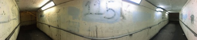
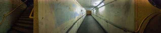
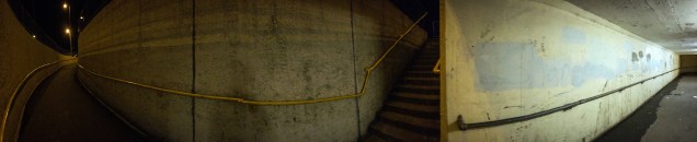
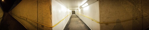
The six final images can be seen below and will be printed on A3 Hahnemühle Photo Rag Baryta paper. I wanted a finish that matched the sense of a camera panning across the scene and after experimenting with a number of different papers, I think that this particular paper works the best. The outcome of my paper experiments are detailed below.
Experiments with video and printing papers
1 Das Unheimliche – the video
I noted that in my Formal Feedback session my tutor suggested experimenting with a slide show approach as a way of presenting my final images. She felt that what would make a difference to my final images would be presenting them one after the other left to right, possibly fading into each other. Having experimented with a slideshow approach for my fifth assignment, I’ve now come back to the idea of exploring this approach for Das Unheimliche. I decided to use Lightroom again.
Firstly I changed the order of the images to facilitate a better slide transition ( i.e. #3, #5, #4, #1, #2 #6 ) .Sound tracks were sourced from the BBC Sound Archive. Early on I realised that the two key decisions were whether to use the panning and zoom option and whether to have a soundtrack ( I had some concerns with both of this options in that they might detract from the viewing effect). After some experimenting with various options, I have narrowed the video options down to three which I intend to bring to a forthcoming Landscape Hangout for critique. At this stage I’m too close to the work and would value some feedback from others less ‘wrapped up’ in it.
- Soundtrack but no panning
- Panning but no sound
- Panning with sound
Update : Landscape Hangout critique (29 November) [ see https://wordpress.com/post/suegreenfieldphotographylandscape.wordpress.com/3294 ]
From our discussion of the three videos, it became clear that everyone felt the second video i.e panning with no sound was the better version.Jack commented that he thought the heartbeat soundtrack a little cliched and I must admit I do agree with him here. With hindsight I think it too obvious and in danger of detracting from the viewing effect.
So, I have selected Unheimliche 3 and renamed it ‘Das Unheimliche’ ( see https://vimeo.com/375134763/b90e815083
2) Das Unheimliche – the images as prints


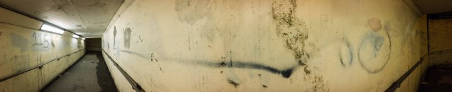
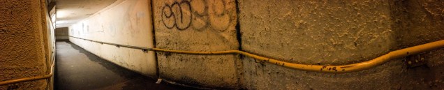
I intend to print all my images myself as I feel that I have more control on the finished prints . For this first assignment though, the size and shape of the final images do present somewhat of a challenge.I’ve opted to print on A3 paper which allows an image size of 3.5 in x 17in. – not an ideal size but just about enough to see detail and colour. To see what might work best with the six final images, I’ve experimented with different types of paper using my Canon Pro- 100S printer and the same image. To do this I purchased a sample pack of Hahnmühle Matt FineArt paper and a sample pack of Hahnmühle Glossy FineArt.
Canon Pro Luster (260 g/m² ) – I often use this paper now as opposed to Ilford Gallerie Smooth Pearl ( previously my favourite). The result provides a more cinematic feel than the matte / rag papers – a sense of a cinematic camera sweep across the scene.
Hahnemühle Glossy Fine Art Baryta (325 gsm) – denser /darker colour with less detail of the steps- the colour of tunnel is probably more accurate.Again the sheen offers a cinematic feel.
Canon Pro Premium Matte (210gsm) – the version printed on this paper lost a little color detail – the matte finish deadened or rather flattened the image which just about works OK with the enhanced grain of the image
Hahnemühle Matt Fine Art Photo Rag Duo (276 gsm) – the colour detail was slightly better that the Canon Matte – again a slightly flattened feel which enhances the sense of the ‘uncanny’…
Hahnemühle Glossy Fine Art Photo Rag Baryta (315 gsm) – good colour / a more bluish feel to the tunnel / clearer detail e.g. steps more visible – slight sheen offers a sense of the cinematic…
Khadi handmade rag ( 210gsm) – this version brought out the enhanced grain of the image which is not surprising as it is not photo paper and very obviously a rag paper. The printer just about coped with its thickness ( I did have a momentary sense of panic when it took a while to get started) but the printing was marred round the edges of the paper where ink splatted ….So this option is not a viable one.
So, apart from the slight change in colour production, it seems that I have the choice of going for the cinematic feel of the luster / glossy fine art paper ( not much difference between Canon and Hahnemühle ) and the flatter, almost deadened colour ( and thereby grimness of location ) of the photographs printed on the matte paper which enhances the existing graininess of the images.
- Panning and soundtrack
2 Das Unheimliche – prints