Reflecting on Photography 2 Landscape

I began this Landscape course with a heady mix of excitement (a new course!) and trepidation   (this was going to be a journey taking me well outside my comfort zone). It has been a real learning journey for me but one that has left me with the realisation that I have been able to create satisfying work that previously I might not have considered or attempted.

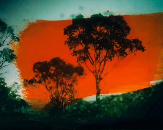
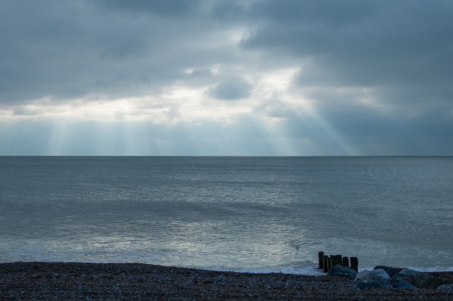
Creech Woods 1944 /2019 (Assignment Five) is my best work. I am really pleased with this slideshow. I feel that it conveys a good sense of tension, uncertainty, vulnerability and emotion. It shows how much my work had developed over the course, drawing as it does on the new skills and knowledge that I have acquired on my learning journey.

Looking back at my assignments, I can see that in developing work I have been more creative and imaginative than in previous courses. In Das Unheimliche (Assignment One), I set out to interpret the sublime less from a physical presence in itself than a mood induced in the onlooker. This idea came from the feeling of unease that I often experience walking through city underpasses and was informed by my reading of Freud’s essay, ‘The Uncanny’. In The View is the Place (Assignment Three) I wrestled for some time with how to convey the concept that a view can be a constructed place before finally capturing the images that I feel might endorse this through the response of the ‘viewer’. And, of course, in Creech Woods 1944/2019 my starting point was my own emotional response to the thought that so many troops had been hidden where I was walking, men waiting among the trees, alone in their thoughts, waiting to go to war. How best to capture photographically what they might be feeling?

I was pleased with the final absented portraits of Shaping out own landscape (Assignment Six). There was a lesson to be learnt here though. Locational challenges such as hanging out of a window not being able to use a tripod, taught me the hard way that you must evaluate the ‘nature’ of a location very carefully, if the work you want to achieve requires a sustained and consistent outcome.

Much of my work has been developed through experimentation, for example, the panning shots in Das Unheimliche, the Photoshop experiments for Two hundred years on (Assignment Two) and the intentional camera movement used in Creech Woods 1944/2019. Creating slideshows with a soundtrack using Lightroom has been a new venture for me. I have become fascinated at how sound and still images can work so well together, taking work to a new level. I want to experiment further with the slideshow format in the future.

Undertaking the research and reading that informed my assignments has been really enjoyable. For my Critical Review (Assignment Four) the challenge was arriving at a subject. This took a while but once chosen, I enjoyed the wide ranging research. Writing the Critical Review was a considerable challenge since I find this kind of writing difficult. I would say though that I have learnt more from writing this Landscape Critical Review than I did on my previous Level 2 course. My tutor’s feedback was very helpful and I now have a much better idea as to how to structure such a review. I feel that I have made some headway here, though there is still room for improvement, not least being more analytical in my writing and more questioning in the handling of texts. And I intend to follow up my tutor’s comment that the Instagram phenonomen could prove a rich seam of inquiry to pursue at Level Three.

I should also acknowledge the support that I have had from other OCA students through work critiqued at the Thames Valley Group meetings and through Landscape Hangouts. I have been lucky to have met up with so many creative and talented OCA students. One highlight was the opportunity to join members of the Thames Valley Group in creating the Open Art Collective. Being a member of the working group setting up our first exhibition at The Lightbox in Woking was a very valuable experience, as was being one of the exhibitors. Since then, when deciding how I might best present my final work, I include the concept of exhibition space alongside other considerations such as printing paper, book formats, and slideshows.

I began this Landscape course knowing very little about the theory or practice of landscape photography. Now at the end of the course I feel a real sense of achievement. Looking back at the ground that I have covered and the work completed, I can see how much I have learnt about landscape photography, photographers and artists and about myself as a photographer. My approach to my work has become increasingly reflective; reflecting on my research and experimentation, listening to what the work of other artists and photographers is telling me, and what critiques of my own work have to say. This has encouraged me to take my work that little bit further; to tease out exactly what I want to say. Do my final images and slideshows communicate what I wanted to say? I believe they do.

I have also noticed that my landscape photography has been developing in a certain way from the very beginning. I have tended to take a strong visual approach to my work. My choice of work for assessment reflects this. My landscapes are always peopled but more often as an expression of absence. Much is said about finding your personal voice, and like many students I ask myself, how do you recognise this personal voice? Is this the beginning?


Waiting…

IMG_3044

This current  project has like  my ‘Conversations in Time’ work (1) gradually emerged during my Level 2 studies but this time during my Landscape course.I had originally thought to call it ‘Sitting’ but perhaps ‘Waiting’ might be more apt.

Originally the idea came from observing a perfectly good armchair dumped on the side of a car park last winter….You have to ask yourself why and then how? It reminded me of Michael Wolff’s work Hong Kong Front Door Backdoor ( see Fig.1)

Michael-Wolf-From-the-series-Hong-Kong-Front-Door-Back-Door-c-Michael-Wolf
Figure.1

Later in my wanderings around our local allotment taking photographs for ‘Cyril’s Plot’ ( Assignment 6), I became increasingly intrigued by the placing of various chairs in and around the allotment plots.

I never ever saw anyone sitting in them.They all seemed to stand proud within their own landscape…waiting. To me they seemed more like absented portraits..saying much about their absent owners by where they were placed and how they were placed. For some reason I find myself drawn to what these chairs say about the individuality of their  owners.Often the allotment chairs are the same plastic design, white or green , so the individuality comes from the placing of them.The ‘story’ they might offer that fascinates me…and it is difficult to resist giving the images captions.P1298x

P1299x

IMG_1183x
Waiting for the match to start
IMG_1186x
The falling out …
IMG_1193x
Over here…

These allotment chairs were the beginning of this project. Since then I find myself looking out for other examples of random chairs within the landscape such as the chairs below seen in a local park in Norway:

11-2283x-1
The meeting…

or the chair seen from a heritage railway carriage (unfortunately seen but not captured) – out in the wilds of the Hampshire farmland facing the track – perhaps waiting for a railway enthusiast and their camera?

There’s no doubt in my mind that this project is going to run and run. I can’t help but find the mix of street and landscape photography and potential for ‘stories’ fascinating.

Illustration

Fig. 1 Wolf,M. (2005) ‘backdoor 02 [Photograph] In: Wolf,M.  ‘Hong Kong Front Door Back Door London: Thames and Hudson

Reference

(1) See Conversations in Time

Lost Land: processing the Australian bushfires – a photo essay

1
Fig. 1

‘the only way I could combat the frustration of this political impotence  [1] and anxiety of watching the country that I love so dearly burning was to produce photographic work’ (Casey)

I’m currently drafting my evaluation of this Landscape course now that I’m at the end of two years of study.I found myself reflecting on how much my own personal and emotional response to my chosen landscapes imbued and drove my work when I came across this Guardian picture essay by Australian photographer Aletheia Casey.

I spent three weeks travelling around Australia five years ago and was much taken by the Australian landscapes I travelled across. Over the last months I’ve watched the terrible havoc and destruction wrought by the bushfires on the television news and spoken to friends who live out there. I don’t know how I would respond to this unfolding tragedy. Casey’s powerful response was to use prints from her last visit to Australia and rework them to transfer her emotions into the images.

4
Fig. 2
3
Fig. 3

What Casey wanted to do was implant her fear and anger into her existing prints by painting them  with oils and inks, and then scratching and reworking them. For me the rich dark colours, sense of sweeping movement and a striking feeling of deterioration / decay within the materiality of these images echo of the reality of these landscapes. This makes for some very emotive and powerful artwork.

Reference

Casey,A. (2020) Lost Land: processing the Australian bushfires – photo essay. Available at:  https://www.theguardian.com/australia-news/2020/jan/24/lost-land-processing-the-australian-bushfires-a-photo-essay?CMP=Share_iOSApp_Other [ Accessed on 24 January 2020]

Illustrations

Figure.1  Casey,A. Lost Land: processing the Australian bushfires – a photo essay http://www.Guardian.com Available at:https://www.theguardian.com/australia-news/2020/jan/24/lost-land-processing-the-australian-bushfires-a-photo-essay?CMP=Share_iOSApp_Other [ Accessed on 24 January 2020]

Figure 2  Casey,A. Lost Land: processing the Australian bushfires – a photo essay http://www.Guardian.com  Available at:https://www.theguardian.com/australia-news/2020/jan/24/lost-land-processing-the-australian-bushfires-a-photo-essay?CMP=Share_iOSApp_Other [ Accessed on 24 January 2020]

Figure 3  Casey,A. Lost Land: processing the Australian bushfires – a photo essay http://www.Guardian.com Available at:https://www.theguardian.com/australia-news/2020/jan/24/lost-land-processing-the-australian-bushfires-a-photo-essay?CMP=Share_iOSApp_Other [ Accessed on 24 January 2020]

‘Shaping our own landscape’ – submission for Assessment

Artist’s statement

Few of us have the opportunity to shape our landscape except perhaps what lies close to us, familiar as our ‘territory’– our back garden. I live in a city surrounded by back gardens of all shapes and sizes but with one common feature they are not static landscapes – they are changing all the time.  These transitions interest and intrigue me, the inspiration behind my project to photograph three English back gardens belonging to a young family, a retired couple and a working couple in their forties between April 2018 and July 2019. I wanted to see what changes might occur, and how much these changes might be shaped by the occupants or owners of the gardens. For while the front garden in a road or terrace can often be part of a collective landscape, the privacy of the back garden encourages a greater freedom of expression and behaviour. There are no people in these photographs– a conscious decision on my part to create a series of absented portraits to record the transitional nature of these gardens. What was interesting was how over time they began to take on a character, becoming ‘social landscapes’ before my eyes. I have tried to convey this. These portraits show how each garden changes but also, in perhaps a more tantalizing way, how differently people shape and interact with a landscape personal to them and the way they live.

Presentation

I have chosen to present A3 prints and close-ups of views from the left hand window series for assessment. I believe these work well not only as a series on their own but are also representative of the whole project. Prints offer time to absorb the small but often significant detail within these landscapes that reveals more of transition than the change in seasons. The close-ups offer differentiated details that take us closer to these social landscapes. I have also included a short slide-show of these views which, in capturing the passage of time, highlighting the change in seasons rather than transitional detail, completes this portrait of transitions within an urban landscape.

Shaping our own landscape…the video can be seen at: https://vimeo.com/382637938/b7fbd61bd4

The images


1x
Figure 32


2x
Figure 33
3x
Figure 34
4x
Figure 35
5x
Figure 36
6x
Figure 37
L to R  Figures 38 and 39
L to R   Figures 40 and 41
L to R  Figures 42 and 43
13x
Figure 44

‘The story’

I chose to take the photographs of the three gardens every month from the attic room in my own house; a location influenced by Andreas Gursky‘s ‘God’s eye view’ approach to his landscape photography. Like Gursky I believed an elevated vantage point can provide a degree of objectivity that draws the viewer in, allowing them to draw their own conclusions as to what they are seeing..

The project was not without its challenges. The angle of view through two narrow windows (both only opening 90 degrees) precluded the use of a tripod. I had to hang out of each window, twisting left and right to take the photographs. It was difficult to prevent camera shake. Thinking that I might present the final images as a slideshow I kept to the same angle for each of the three views using a printed image as a reference point. Even so aligning the views exactly proved very difficult – as an be seen below:

    Fig. 1  May 2018

This alignment difficulty presented a conundrum when it came to presenting the final images. I had started out intending to create a triptych of views taken between April 2018 and July 2019. Experimenting with slideshow presentations led me to reject the triptych idea ( see Experiments ) as well as a diptych version of the left and right hand views  (the middle view being represented in both left and right view, I judged there no need to retain it). I eventually decided to present the views from the left hand window. These images particularly work well as a series as well as being representative of the whole project.

  • Research and influences

Looking back at my work now I recognise the direct influence of Gursky ‘God’s eye view in choosing the elevation of my camera and that of Sophie Calle‘s The Hotel, Room 47 in the presenting of differentiated detail. Simon Robert’s sound recordings for his work Inscapes encouraged me to have a go at recording the sounds of my back garden for the slideshow version of my images. My research also ranged from the history of back gardens to photographers attracted to gardens as being as Martin Parr explains ‘one of those subjects that all photographers are tempted to try during their careers’ (Parr). For example, I was fortunate to discover J.M. Allen’s excellent book The Photographer in the Garden, which drew my attention to a number of photographers, some already known to me, who were or still are interested in the garden as social landscape e.g. Chris Steele-Perkins, Bill Owens, Patrick Zachmann, and Martin Parr. I also followed up my tutor’s suggestion to look at Anna Fox and Barbara Hepworth ) and pursued references that I came across to Ruth Orkin, Carl Van Vechten, Sigismund Blumen and Marry Alpern, photographers who used the window as a frame to observe, analyze and count moments in time from behind the lens and behind the veil of security at a distance’ (Feurehelm); not dissimilar to what I was doing! Quite late on I discovered Hayahisa Tomiya’s work ‘TPP’ .Taken over five years from the window of his flat, his photographs reveal different people using a public ping-pong table and its surroundings in different ways. A similar idea to mine though featuring people and a camera position that sometimes moved right or left depending on who was at the table. My work does not directly reference these photographers, but the context within which I have been working is not dissimilar.

  • Feedback and peer critique

When I presented prints of the views and close up detail to a OCA critique at the 2018 Brighton Photo Biennial weekend, feedback was favourable though interestingly the nuanced detail of the  close-ups that interested me was felt unnecessary. I returned to this detail after taking three versions of a video slide show and prints to a OCA Thames Valley Group meeting for critique. Feedback was positive; it was encouraging to learn that my idea of prints plus video had some traction.

Though people preferred Slideshow 1 ;the view from the left hand window with no soundtrack, I was still not entirely happy with the video presentation’s ability to lift the quality of visual or allow  sufficient ‘viewing’ time for the detail within the  landscapes that I think enhances the concept of transition. I discussed this with my tutor who agreed with me. We both thought that the prints alone would better represent this project. Interestingly my tutor felt that she would like to see interesting detail bigger, suggesting that I try cropping  sections and presenting them alongside the complete ‘view.’ I liked this idea reworking  the series as seen in my post Revised edit

In preparing for assessment,I took one more look at the slideshow. I found a more suitable soundtrack ( birdsong) and re-edited the views. Feedback from fellow students was favourable. This revised slideshow now accompanies the prints and close-ups that I have selected for assessment.

Reflection

Looking at the final images for all three window views I believe that the idea of transitions within these urban landscapes is conveyed well; the series of final images selected for assessment presented in a coherent way. There is a sense within these small urban spaces that the landscape exists as an evolving, dynamic system. I think my decision not to photograph people in their gardens but use traces of their presence as markers of transition works well.

If I’m honest I am less happy with the variable quality of the final photographs due to the gardens’ east to west position presenting the challenge of taking photographs directly into the sun

Having had the idea to capture the concept of transition in the landscape through observing three back gardens, I found it useful to share the progress of my triptych of views with fellow students and tutors. Feedback helped me decide how to shape and present the work; particularly when experimenting with a slideshow approach. My efforts here were disappointing. Alignment difficulties aside, I felt the slideshow needed a soundtrack. Lack of success in finding one that enhanced the images, I recorded one in my own back garden.This led me to try my hand at successfully editing; a new skill that compensated for a sense of place dominated by the intrusive all-pervading traffic noise (Slideshow 9 ). Reflecting on how best to present this project, I did later return to the video slide show, editing the sequence of images and replacing my own soundtrack with a far better one of birdsong in an urban landscape. It is this revised slideshow that I am using for assessment.

I enjoyed this final assignment offering as it did the opportunity to explore a landscape in depth over the length of the course. I could have submitted The Painted Church , my more traditional project for assessment. But for me ‘Shaping our own landscape’ is a more personal and intriguing view of transition; an opportunity to observe and reflect on how we as individuals move within and shape our own personal urban landscape.

References

Allen,J.M. (2018) The Photographer in the Garden. New York: Aperture

Feuerhelm,B. ( 2019) Hayahisa Tomiyasu: TTP, An Immoveable Feat. At:https://americansuburbx.com/2018/08/hayahisa-tomiyasu-ttp-immoveable-feat.html(Accessed on 16 October `2019)

Magnum Photos. At: https://www.magnumphotos.com/arts-culture/nature/photographers-garden/ (Accessed on 18 October 2019)

Roberts,S. (2019) Inscapes . At:  https://wordpress.com/post/suegreenfieldphotographylandscape.wordpress.com/2693


‘Creech Woods 1944/2019’ – submission for Assessment

Artist’s statement

Walking is the beginning…

Creech Woods is an evocative response to a walk I first took through the Forest of Bere in May 2019 – the first of many that summer. Standing alone in a clearing I considered what I had recently discovered about Creech Woods; that 3850 thousand troops had lived hidden in two tented assembly camps amongst its trees immediately before they set sail for Normandy, on 6th June 1944, D Day.

There is no reference to these marshalling camps or their troops within Creech Woods. The men passed through, unremembered, a brief presence. Few people walking their dogs through the woods today are aware that they tread where these troops lived, prepared and waited to go to war.

Standing there and straining impossibly to hear the noise of those camps, I decided then that I wanted to create a visual reference – to express a sense of absence within this landscape that comes from the presence of these troops fading over time in our collective memory. I wanted to convey a sense of the tension, uncertainty, vulnerability and emotion that must surely been present as the troops waited among the trees for D-Day.

The concept behind the work is as much a questioning of whether we can understand or convey visually what we cannot know ourselves, as placing a marker down saying this happened and must not be forgotten.


Presentation

I have chosen to present nine images for assessment. These are presented as a video slideshow.

Creech Woods 1944 / 2019 …the video  can be seen at:    https://vimeo.com/385795770/ff0e74e3ae

The slideshow format presents the series well, drawing the viewer in as it does, visually and emotionally. I can envisage it working well in an exhibition space surrounded by A3 or even A2 prints.The images that I  would exhibit as prints alongside the slideshow  are shown below – prints of these images accompany  the slideshow presentation to demonstrate the viability of this approach.

The A3 prints ( view left to right,top to bottom)

       [ Top row: Figures 23,24,25,  Middle row: Figures 26,27,28,  Bottom row:Figures 29,30,31 ]

‘The story’

On my many walks through Creech Woods, I paused in clearings to experiment with different ways of capturing the play of light and shadow through the trees eventually  settling on intentional camera movement to convey the tension, uncertainty, vulnerability and emotion that must surely been present as the troops waited amongst the trees for D-Day –  an abstraction of reality. Patterns of light and dark suggest a range of emotions from vulnerability, fear and tension to excitement and hope. These blurred, fragmented but dynamic images serve more as a ‘ metaphor for memory’ and ‘ its degradation’  [1] than Gerhard Richter’s use of blur to make everything equally important and equally unimportant’. And at the end of the day, I am reminded of Martin Gayford’s view that looking at Richter’s work is not dissimilar to looking at a Rorschach blot i.e. leaving you, the viewer, to see what images you see in the work.Perhaps this is what the viewer sees and experiences when they look at Creech Woods 1944 / 2019 … each viewer a different perspective but a marker placed for all that…

  • Research and influences

I began my research looking for relevant historical records and artists and photographers who have  worked with historical memory and absence, and within wartime landscapes as they exist today, such as Guillaume Amat (‘Espace Mémorials’), Chloe Dewe Mathews ( ‘Shot at Dawn)’, and Simon Attie (‘Writing on the wall'(1992-94)    or whose work had a particular relevance to my theme or concept ( see Memory and absence)  .As my work progressed Lynda Laird‘s use of Odette Brefort’s diary in Dans Le Noir to get into the headspace of someone living in Deauville at the time of the D Day landings prompted my exploration of diary and reminiscence text. Rory Carnegie‘s beautiful ‘Islay‘  led me into exploring the idea of layering of history within the landscape ( see Experiments ) .But Rob Hudson ’s powerful work Mametz Wood encouraged me to explore a conceptual approach for Creech Woods. And the disturbing sense of a forest at night revealed in Paul Seawright’s work ‘The Forest’ gave me pause for thought in terms of how the night time quality of the trees in Creech Wood, that edginess of shadow and dark impenetrable space  within the woodland might be conveyed.

  • Peer critique

Yet again I was able to test out ideas with other OCA students, particularly the OCA Thames Valley Group. Having others critique your  work really helps to progress a project. I also received helpful suggestions for photographers to research via Landscape Hangouts.

Reflection

This has been by far the most enjoyable assignment. I appreciated the freedom of working on a self-directed project; not only enjoying developing an idea that enthused me from the very start but also the way the project brought together in an unforced way, skills and knowledge that I had acquired on my way through the course.

Looking back now I can say that this assignment drew out my creativity both in terms of concept development and choice of techniques to deliver the concept. The finished images do demonstrate visual awareness and observational skills. I noticed early on that a certain play of light within the wood and different kinds of trees and clearings produced more visually interesting shapes, and the dynamic patterns of the kind that I was looking for. Having used ICM  for the first time, I think that I might well be coming back to this technique in the future.

As regards quality of outcome, I realised my original concept; the final images presented in a coherent and creative manner. What is interesting though, is a dawning  realisation that my work has been developing in a certain way from the beginning of this course. My landscapes are always peopled but more often as an expression of presence.

References

Gayford,M. (1998) ‘Zen and the abstract art of the squeegee’. In: The Telegraph 19 September 1998 [online] At: https://www.telegraph.co.uk/culture/4715713/Zen-and-the-abstract-art-of-the-squeegee.html (Accessed 7 August 2019)

McCarthy,T. (2011) ‘Blurred visionary: Gerhard Richter’s photo-paintings’In: The Guardian 22 September 2011 [online] At: https://www.theguardian.com/artanddesign/2011/sep/22/gerhard-richter-tate-retrospective-panorama (Accessed 5 August 2019)

Seawright,P. The Forest At: http://www.paulseawright.com/the-forest (Accessed on 23 May 2019)


Critical Review – submission for Assessment

The role of photography in shaping how tourists perceive and interact with the landscape

My Critical Review can be found at: Final version of Critical Review

I decided to look at the tourist gaze with the idea of focusing on the role of landscape photography in developing and sustaining the tourist gaze; an idea that occurred to me after returning from a trip to New Zealand in 2018. On an organised trip such as ours, enjoyable though it was, you find yourself being shepherded to ‘view points’ to take almost obligatory photographs of these designated beauty spots. I noticed how everyone, including myself, seemed to take the same view as a memento of that part of the trip, whether a selfie, group photo or straight view. Given the timescale of the itinerary, we had little time to distance ourselves from this activity to absorb what we were seeing, and perhaps wonder how best to take an image that represented what we saw before us. I had never really noticed this before and suspect the influence of my landscape work playing a part here.

Back home I was left wondering how far the tourist perspective of landscape has been moulded by photography; whether the postcard has shaped and continues to shape how we view and photograph the landscape; or has social media firmly taken over this role? (See my Critical review proposal). Within this context I developed a first draft that questioned whether Instagram had become the new postcard.

Feedback

My tutor felt this draft was an ‘interesting, well written and researched piece worthy of a longer essay at some point’ (Formative Feedback ). She suggested though that the title might be reframed to better fit the content of my essay. I felt that this was fair comment, changing the title to ‘The role of photography in shaping how tourists perceive and interact with the landscape’. Reflecting further on my tutor’s feedback, I reworked the introduction to reference later arguments in the essay and amended the conclusion to better tie in with this revised introduction. I was pleased that my tutor felt this second revised version had more clarity and following a further suggestion to assert my methodology in the introduction, I arrived at the final version which I am submitting for assessment.

Reflection

I enjoyed working on this critical review, engaging with a subject close to my heart developing as it did from a personal experience. But I also found the research, though challenging, both fascinating and absorbing. I began with journals. Following up numerous leads found in references quoted in these journals, soon became a reiterative process as the same titles kept occurring. I had to broaden my search to tourism and visual culture journals, to newspaper articles and statistical sources. Instagram, Facebook and Touchnote provided rich source material too. The topic proved to be far wider than initial research suggested and in writing the review I had to edit material carefully to come within the 2000 word limit. As a consequence, Simon Roberts work New Verdute, which I had hoped to include as an example of the postcard landscape role being reinvented, did not make the cut.

My critical review referenced the work of Martin Parr and Meghan Krauss. But given that the context in which I was exploring the role of photography in shaping the tourist gaze was Instagram and the postcard, it proved difficult to pinpoint key practitioners to consider in any depth. I did though evaluate the work of John Hinde whose colour postcards were so influential.

I think that I have learnt more from writing this Landscape Critical Review than on my previous Gesture and Meaning course. My research strategy was better defined and all the better for that. But critically with my tutor’s support I have a much better idea as to how to structure a critical review. I realise that there is still much room for improvement, such as being more questioning in the handling of texts and more analytical in my writing but I feel that I have made some headway here.

And I note my tutor’s comment that my research into the Instagram phenomenon could prove to be a rich seam of inquiry should I wish to pursue this further at Level 3. I think that I may well do this.


References

Krauss,M. Observer Observed. At: https://meghankrauss.com/ (Accessed on 8 April 2019)

Hinde,J. At: http://johnhindecollection.com/ireland10.html (Accessed on 9 April 2019)

Nӓgele,E. Wish you were here: the early days of my photography. At: http://www.nagele.co.uk/Stockphotochat/postcard.htm (Accessed on 12 April 2019)

Parr,M. (2018) Small World. (2nd revised edition) Stockport: Dewi Lewis Publishing


‘The View is the Place’ – submission for Assessment

Artist’s statement

 ‘Space is transformed into place as it acquires definition and meaning’                           (Yi-Fu Tuan:136)

The idea that a view could be a constructed place with definition and meaning came to me when walking the landscape of my childhood summers, the coastline of the Goring Gap. Uncelebrated for centuries, and almost untouched by seafront commercialisation, this coastline  has changed little in natural terms, with one exception, the proliferation of memorial benches.

If, as Yi-Fu Tuan writes, space is experienced directly as having room in which to move, and place being a pause in that movement making it possible for a locality to become a centre of value, then these benches were examples of space being transformed into place. These constructed places offer somewhere to sit, to rest, a place for memory and reflection. They face the sea and offer a view.

I wanted to capture a sense of these constructed places, to express photographically what my imagination was seeing and what I was feeling within these places and I realised that the view was the key to this, the way forward. For the view is an integral part of these constructed places, it offers the experience of place that comes from pausing there; the opportunity to let your mind roam freely. The view  represents and visually expresses the constructed place. It acquires definition and meaning for the viewer; this may be personal or not, experiential or not, it maybe be more than what you actually see, rather what you feel, but at the time of looking out from these memorial benches, the view encompasses and becomes the constructed place.

Presentation

I have chosen to present six images for assessment (see Reworking Assignment 3  ). I think that these final images have coherence. I wanted visual interest but not so much that it became a distraction, more a quality that opened the way for a meditative feel. Though the compositional ‘theme’ running through the final selection of images series now reminds me of Andreas Gursky’s work, particularly ‘The Rhine II’ , this was not intentional.

13
Figure 17
12
Figure 18
10-1397
Figure 19
3
Figure 20
5
Figure 21
79-1912
Figure 22

The images are printed large on A3 paper to give the viewer the feeling of being in the picture. These views  could also be presented in a simple shallow box, the box being part of the concept, i.e. offering a space/ place for contemplation, but for the purposes of assessment and the time constraints therein, I shall just submit the prints.

The ‘story’

I set out along the Goring Gap initially photographing the memorial benches in their locations, recording their plaques and the tributes placed around them. I sat on the benches and captured the view that I saw before me. I then began to experiment with other ways of conveying the sense of a constructed place. I wanted my images to be free of the symbolism of the small tributes laid out significantly on and around these benches. These experiments particularly reference  the work of Susan Hiller and Guillaume Amat

  • Feedback and peer critique

Feedback from a Thames Valley Group  meeting (But isn’t that just a view?) sent me back to  revisit the whole idea and its interpretation. But after much thought I decided to follow my instinct that the ‘view’ is a visual expression of the constructed space created by placing a memorial bench in the landscape. After discussing my work with my tutor I followed up key actions points (Reworking Assignment 3 ) arriving at my final selection of images and deciding how these would be presented for assessment.

  • Research and influences

In developing the concept for this assignment my work particularly references the writings of Yi-Fu Tuan and David Bate . Bate‘s idea that a photograph could be used as a space, a location for memory-traces, underpinned my development of the idea that a view could be a constructed place.My research into memorialisation uncovered a number of strands; the cultural aspect of memorialisation; its apparent commercialisation; and the act of memorialisation itself, in this case the donation of memorial benches. Though instinctively drawn to the cultural aspect, I decided the commemorative angle was the way to go as better fitting my intended landscape. What was surprising was how little my research turned up in the way of artistic interpretation that I could draw upon. That said, my experimental work references Susan Hiller and Guillaume Amat.  I also followed up my tutor’s suggestion to check out Diane Arbus and I was lucky later to see her ‘A Box of Ten Photographs at the Hayward Gallery exhibition Diane Arbus …in the beginning

Reflection

Not for the first time I found myself pointing my camera lens directly into the sun, this time to achieve the direct view from the bench that I needed. My first venture was out on a sunny day when the problem of flare quickly became apparent, very quickly. I went back to look at Fay Godwin’s work for inspiration, particularly her coastline images in The Saxon Shore Way. She was working on the south coast so would have had similar lighting situations. I came away as always inspired by her work but still left wondering how best to tackle the blue sky and brilliant sunshine head on. Various experiments with lens hoods and filters later led me to opt for dull weather photo shoots. Surprisingly this weather began to offer the kind of light and cloud effect nearer to what I was looking for.

There is a good deal of experimentation underpinning the final images though this may not seem apparent. Initially, in setting set out to convey the sense of constructed space, I arrived at what felt to be a very literal interpretation. Experimenting with placing plaques and views within a seemingly empty space or the view seen from a bench actually on the bench appeared on reflection contrived. It didn’t echo the sense of a constructed place. I gradually came to the idea that the concept of the view as the place was the better fit.

One thing I have noticed during this assignment is my thinking outside my ‘usual literal box’. This came from searching for a way of expressing photographically what my imagination was seeing and what I was feeling within these constructed places along the Goring Gap. This became more complex that I had expected. By going through various progressive stages including experimentation, I eventually teased out the concept for this work. I think that the views selected for this assignment represent and express ‘The View is the Place’.

The View is the Place…  

ContactSheet-001

References

Bate,D. (2010) The Memory of Photography [online], Photographies, 3 (2), pp. 243-257  Available at: https://doi.org/10.1080/17540763.2010.499609 [Accessed 31 October 2018 ]

Tuan,Yi-Fu.(1977) Space and Place. Minneapolis: University of Minneapolis.

Platell, E. Spaces of Engagement: Memorials [online]. Available at: http://designonline.org.au/spaces-of-engagement-memorials/ (Accessed 4 October 2018 )

‘Two hundred years on…’ – submission for Assessment

Artist’s statement

‘Two hundred years on’ marks a road trip that I took through rural Hampshire in the summer of  2018 – a response to what I saw and felt travelling through this landscape. I took my route from William Cobbett’s ‘Rural Rides’, following his journey by horse across Hampshire almost two hundred years earlier in 1823. Along the way he documented the prevailing conditions in the countryside to later support his case against landlords before a Parliamentary Committee. I set out with my camera to capture a personal response to this Hampshire landscape. Reflecting on what I was seeing, I gradually realised what I wanted to convey through my photographs – a land unchanged but a landscape commodified and altered by our attentions. Defined and dominated by the car as rural Hampshire is, Cobbett would likely recognise the land that I saw, but not perhaps its ever diversifying landscape.

Presentation

I have chosen ten images for assessment. I decided to present these images as prints rather than develop an earlier prototype book designed as a comparative commentary (see below). I feel that the images work best as prints, unaccompanied by text. The viewer can look at, and see, the landscape for themselves.

1
Figure 7
2
Figure 8
3
Figure 9
4
Figure 10
5
Figure 11
6
Figure 12
7
Figure 13
8
Figure 14
9
Figure 15
10
Figure 16

‘The story’

Arriving at the final version of this assignment has been a developmental journey in itself – a journey of three stages.

1) ’12 places’

I set out initially to see how the landscape along my route had changed since Cobbett’s time, and whether there were any visual signs of this countryside being on the verge of Brexit. It took me four trips to complete the route.  I adjusted Yan Wang Preston’s approach in ‘Mother River to my much shorter route, deciding to take a photograph every six miles. I hoped that this strategy would take me away from clichéd pictorial landscapes and make fora more interesting commentary on Hampshire in 2018.  At each of the twelve stopping places it was all about finding something that was expressive of that location.

The resulting images fell into two distinct sets; the identified stopping places, and then signs and notices spotted as I drove through the countryside.  I chose to submit the stopping places as a series entitled ‘12 places’ ; an analogy of rural change at a time when the country and the countryside awaited Brexit.

 2) A comparative commentary

Reflecting on my tutor’s feedback that the concept was a little over complicated, thereby losing focus (mainly through my use of grid references and references to Brexit), I considered her suggestion to refine the final selection of photographs taking images from both sets (see Sequencing the journey).

I liked the idea of a reflective comparative commentary using Cobbett quotes and my own thoughts so I reworked the selection of images and designed a prototype book (see Cover  and Contents ).

Later though, looking back at this commentary from the perspective of being near the end of the course and with the developmental experience of other assignments, I felt that it was not that successful.

3) The final versionTwo hundred years on’

I raised my concern with my tutor who agreed that it was weakest of my assignments. We discussed a few creative ways to make the ‘work a more satisfying piece’ and I went back to the second set of original images ( signs and notices) to experiment with text within the landscape (see Experiments). ‘Two hundred years on’ evolved from these experiments and became the final version of this assignment.

  • Research and influences

My work references a number of photographers that I came across in researching Road trips . Though I travelled by car, unlike Todd Hido’s approach for ‘A Road Divided’, I chose to get out of the car to take my images. I wanted to move within the location; to capture scenes that were neither framed by my car’s position nor by the car windows. While I found Doug Rickard’s work with Google Street View really interesting, I made a conscious decision to use the software for planning and identifying each location en route, not to recompose the Google image to achieve the end photograph.

My choice to change to a 2 x 3 image ratio was influenced by Paul Graham’s decision to create a wide angled view in his Troubled Land images – a view requiring the viewer to apply an equally considered look at what appears initially to be a pictorial landscape. Only when you look hard do you see detail in his landscapes that expresses a nuanced interpretation of and allusion to the conflict within the land. I carried this concept of a nuanced interpretation of the landscape with me as I travelled. This idea of reading the symbols within the context of the landscape in which they reside resonated with me. It struck me that there might well be ‘symbols’ within the rural landscape that I was travelling through that  could be ‘read’, allowing my landscape images to be more than a pictorial ‘offering’.

  • Feedback and critique

My tutor’s initial feedback and our later discussion at the end of the course, when I raised my concern that my revised series of images were still not as good as I would have wished, was very helpful in developing this work. I also appreciated help in sequencing my earlier images from fellow students in a Landscape Hangout and later being able to discuss my early experiments with text and sepia images at a OCA Thames Valley Group meeting.

Reflection

Well, with hindsight I think my starting point, Cobbett and Brexit, was over ambitious. I realised early on that it was too soon to find any real visual representation of Brexit. Time available plus a route through small rural communities where I rarely saw anyone conspired against the Brexit angle. You need time to talk to people to achieve a real sense of how they feel about things, as did Peter Dench on his 2017 A1 road trip.

Though dropping the Brexit angle gave me the real opportunity to ‘read’ the landscape without a preformed script, it has taken me some time to achieve a series of images that convey the personal response to the landscape that I was looking for. I think my intention to  show how this rural landscape is in itself a dichotomy – both unchanged, and changing – has through reflection and experimentation been achieved.

References

Bonaventura,P. (2003) Paul Graham: The Troubles [online]. Available from: http://circaartmagazine.website/articles/paul-graham-the-troubles/ [Accessed 27 July 2018]

Cobbett,W. (1950) Rural rides. abridged London: George G.Harrap &Co.Ltd

Clifford,E. (2018) Peter Dench travels the length of Britain up the A1 [online]. Available from: http://www.bjp-online.com/2018/01/peter-dench-a1/[Accessed 26 July 2018]

Soth, A. (2018) Sleeping By The Mississippi [online]. Available from: https://www.magnumphotos.com/arts-culture/alec-soth-sleeping-by-the-mississippi/ [Accessed 25 July 1018]


Printing workshop: OCA Thames Valley Group meeting [ January 2019 ]

This month’s meeting was a practical workshop on printing led by OCA Alumni John Umney. I had been looking forward to this workshop for sometime, and ideally would have liked it a few months before I set out on my marathon printing session for the March Assessment!

IMG_2030We were asked to bring some examples of printing, either prints we were happy with or those which turned out as disappointing or definitely mishaps.

So, the morning’s session focused on looking at these examples, asking the question what is the print saying and was this what was intended. This discussion was very helpful in that it teased out a number  of points that I had not necessarily thought that much about. For example:

  • how the appearance of a print can change when moved around- John demonstrated this with one of Jonathan’s prints where the colour detail changed when lifted off the table and placed against the white wall. Later we could see the same change in appearance when a print of some artwork was held close to the window as opposed to laying on the wooden table.The colours became more vibrant. This led to a debate about how our images would be seen at assessment given they would be likely printed at home, or if commercially printed, seen at home under lighting likely to be different to the assessment room. John’s advice was to indicate what we intended by our choice of printing / selection of print. Certainly, I have done this for one of my assignments ( whew!)
  • the change to the image coming from the colour of the print paper can be quite significant in altering the context.Interestingly, I had decided to change the paper I originally intended to use for the majority of assessment printing from a ‘luster’ to a ‘smooth pearl’ as I felt the whiter paper of the luster worked against rather than complemented the images – the smooth pearl being a more creamy appearance.
  • One thing I had not really considered was the impact that the margin used might have on a print. I tend to favour a wide margin but in future will consider whether this works for the image. Again, those of us preparing for assessment raised the point that we have been told in a number of forums that assessors prefer wide margins as it makes handling prints easier.

Other points raised after lunch developed into a useful printing checklist:

      • Check printer nozzles every time before printing ( something I do not always do)
      • Use test prints on cheaper paper – yes, I definitely do this!
      • Calibrate your screen ( and keep on top of this!!). I know that I need to do this again but didn’t want to carry this out just before my assessment printing as I don’t always have much success  with calibrating the screen. I was reassured a little to find that I was not the only one who found they had problems doing this. I use Colormunki but I noted that others used Spider. I’m intending to change my computer this Spring so I maybe I should consider trying Spider.
      • Use the right ink for your printer- must admit I wouldn’t dare not to!

Talking about paper size, Dawn reminded us that Mimi Mollica had told us not to print on ‘A’ paper because this tends to make work stationery but rather use sizes such as 10 x 8 ( best to buy larger and cut to size). This is an interesting point and worth holding on to for future work, though again we are asked for A3 prints when it comes to assessment.

This technical talk was followed by John showing us a selection of his work including what he presented as his body of work in Level 3 which I was very interested to see having read about it.

All in all a very useful meeting. And many thanks to John for his excellent workshop. I came away with some good pointers as to how to improve my prints but also reassured that I knew a little more about printing than I had thought – still plenty of room for improvement though!

‘Das Unheimliche’ – submission for Assessment

Artist’s statement

 ‘the city is probably the most privileged site for the sublime as a threatening place, as it is one of the most common attributes given to cities now – likely to evoke fear equal to a brutal countryside landscape…..endless spaces for potential anxiety and fear’ (Bate,2016:117).

I am particularly drawn to the concept of the uncanny in art; a concept associated with Sigmund Freud. Freud believed that the sublime related to repressed desire and the uncanny. In his essay ‘The Uncanny’ he wrote that ‘the uncanny is that class of the terrifying which leads back to something long known to us, once very familiar’ (Freud,1919 :15).

This idea that strange and anxious feelings can be created by the familiar in an unfamiliar context led me to explore the sublime within the context of the uncanny – the feeling of discomfort when seeing something simultaneously familiar and alien. I chose to photograph a city underpass – a familiar place but one at night that makes me feel unsafe and insecure.

Liz Wells associates the sublime ‘with awe, danger and pain, with places where accidents happen, where things run beyond human control, where nature is untameable’ (Wells,2011:48 ), but  she continues :

‘it is not the physical presence in itself so much as the mood induced in the onlooker, who is also subject to a range of other personal mood-forming factors’.

Das Unheimliche[1] explores the mood that the sublime can induce in the onlooker- the feeling of edginess and discomfort; a sense of something unseen; the familiar versus the alien within a seemingly recognizable urban landscape – the underpass.


Presentation

I have chosen to present six images for assessment. These are presented as A3 prints.

The six images are printed on A3 Hahnemühle Photo Rag Baryta paper. I wanted a finish that matched the cinematic sense of a camera panning across the scene, and after experimenting with a number of different papers, I think that this particular paper does this.

In a gallery setting I would envisage the images being printed on paper larger than A3 and of a ratio better suited to their shape, perhaps on a roll. I would also consider presenting a slideshow of the work as it better presents images which would benefit from being much larger than A3 – an alternative but also, possibly an additional complimentary approach to  exhibiting prints. To this end, I have created a slideshow that draws the viewer into that feeling of unease that the city underpass generates. The slideshow is silent. After experimenting with sound (for example, the heartbeat in Unheimliche 4, see  Presenting Assignment 1 , I decided that a silent version works better than clichéd sound effects.

Das Unheimliche … the video slideshow can be seen at:  https://vimeo.com/375134763/b90e815083

The images

I have chosen to present six  images for assessment.

Unheimliche #1xFigure 1
Unheimliche #2xFigure  2
Unheimliche #3xFigure  3
Unheimliche #4xFigure  4
Unheimliche #5xFigure  5
Unheimliche #6xFigure 6

I was looking to create a sense of anxiety and fear within my images and had the luck to find a  local underpass with a number of awkwardly angled exits made all the more unwelcoming at night by  glaring strip lighting. Carrying out a experimental photoshoots there during the day and at night I realised that the unsettling feel of the underpass that I was looking for was achievable at night using my iPhone panning feature.

Research and influences

Apart from Freud, my  work particularly references that of  David George and Andre Tarkovsky. George’s urban landscapes in Hackney By Night like those of Thomas Ruff in his series Nacht (1992-96) and Rut Blees Luxembourg evoke a sense of the uncanny for me. I chose to follow George‘s approach of not bringing any external lighting to these scenes and to opt for landscapes devoid of people – any hint of human presence coming from graffiti on the walls of the underpass or shadow.

Crucially though it was Andrei Tarkovsky’s film Stalker that suggested the idea of using panning shots. I was struck by how colour, but particularly the use of long panning camera work created a real feeling  of discomfort and anxiety in the film. I decided to use a panning approach as I wanted to create a similar, unsettling reaction to the urban landscape of the underpass. I also researched the Colour of fear to inform my decision whether to gravitate towards dark places, shadows that conceal or suggest concealment or choose to work in colour as Tarkovsky did in Stalker. My decision to work in colour was later reinforced by peer critique and what I observed in the Dark Matters section at the London Nights exhibition.

Feedback and peer critique

Following Formative Feedback, I re-edited the final selection of images, experimenting with filters and cropping to achieve a cinematic effect feel. (see Reworking assignment 1) Peer feedback also proved very helpful. Consensus at a OCA Thames Valley Group  meeting was that the images delivered a sense of the uncanny;  the colour version worked better than black and white and the images should not be cropped.  This reinforced my instinct that the wider image created a sense of turning your head quickly, as if to see some fleeting shadow or person sensed more than seen.

One comment suggesting taking the horizontal image right up to the vertical edge of the paper to allow the images to flow into each other if placed side by side led me to experiment with a slide presentation. To gauge whether this would work better than prints in delivering the sense of the uncanny I later presented prints and three versions of the video for critique at a  Landscape 2 Hangout

Reflection

Das Unheimliche proved more of a technical challenge than I expected. I had an idea of  the mood I wanted to create, intending to draw this out from a combination of setting, lighting, movement and colour. After some panning practice with my iPhone I achieved the movement and the visual impact i.e. strange, confusing entrances, exits, passage ways  and shadows etc. – the  sense of turning the head quickly. Shooting at night presented a real lighting challenge and given the location I had to accept street lamps and underpass lighting rather than using additional photographic lighting. The resulting quality and colour in the images were less good than expected but this did contribute to a distorted, unsettling perception of the familiar underpass.

The decision to use a panning approach came out of experimentation early on. I discovered that this successfully created the sense of trying  to catch what appears at the corners of your eyes; engendering a sense of disorientation. I also experimented with filters and fine art paper and the use of panning and fade within the slide show to achieve a visual quality underpinning the concept of the uncanny.

Does Das Unheimliche evoke a sense of the uncanny? I think so, though it is probably a question of degree, and what Liz Wells describes as ‘ a range of other personal mood-forming factors’ that you might bring to the viewing.


References

Bate,D. ( 2016)2nd ed. Photography: The Key Concepts. London: Bloomsbury

Freud,S. (1919) The Uncanny. 2003 kindle edition. London: Penguin Classics

Wells, L. (2011). Land Matters: Landscape Photography, Culture and Identity. London: I.B.Tauris.


[1] Translation of Das Unheimliche is ‘The Uncanny’